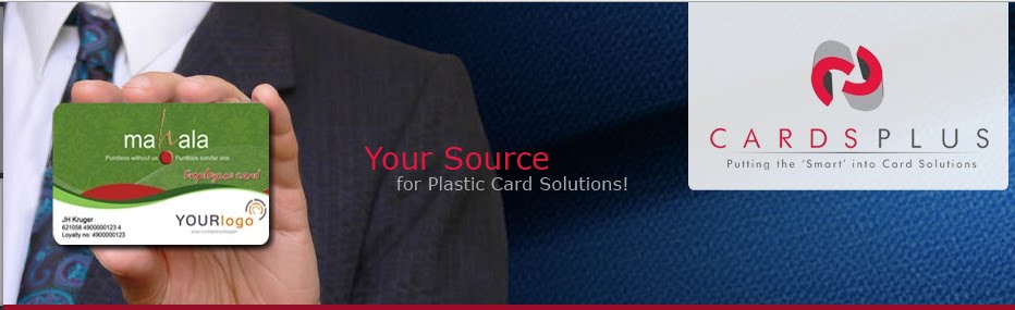


5 Industry Secrets to a Fantastic Card Design
30.3.10

Want to take your client’s breath away when they get their first look at your new card? Try these secrets we have learned on your next design.
1. Put a face on it! Consumers like the cards with gorgeous models. Not only do their faces print wonderfully, but your clients get the human connection that is so vital in advertising and marketing.
2. Choose fonts carefully. Some fonts are clearer to read than others when printed on a small space. There is a lot of information to place on a card and fonts that are consistent in shape print the clearest. Stay away from fonts that have thick and thin lines as they tend to be too difficult to read at a small point size.
3. Go Bold! In colour that is! Cards that take our breath away are full of electrifying, vibrant, bold colours. Keep it young, modern and fresh by pairing a bold colour with crisp white or rich black backgrounds to make the design star of the show!
4. Design in CYMK. There is a big difference between images designed for a webpage (in RGB) and images designed in CYMK for print. Make sure your design programme is set to the correct setting to ensure that the colours are truly as you wish for them to be.
5. Form follows Function. Think of a card as a ‘mini-billboard’ propagating your message. Design accordingly. Make your message the most important message in that 54X86mm space.

0 comments:
Post a Comment